How to Use Soft Pastels to Make a Big Color Impact
It’s natural for some brides to balk at the thought of a pastel color scheme for their wedding. A lighter color palette can scream baby shower when a bride is trying to portray a polished, grown-up feel for the event. But don’t be intimidated by the light color palette’s gentle reputation. Take soft shades from mild to mind-blowing with these tips.
Go Toward the Light
Some brides might not consider lighter colors in their wedding backdrop for fear of what the hues convey. “Lighter colors can be construed as not as sophisticated,” says Jes Gordon, an event designer and owner of the properFUN event firm in New York. But it’s all about how you use them. Light colors have their heavenly connotations, but can be edgy, especially when balanced against stark lines and patterns. There’s nothing mellow about rosy pink when it pops against a dramatic background, or lavender when it sneaks its way into a cocktail.
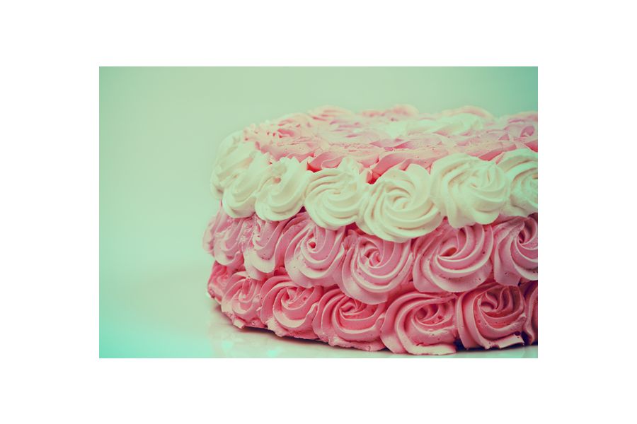
Opt for Ombré
When creating a stylish light color palette, ombré can save the day. The light-to-dark color scale trend still is popular, and it’s ideal for showing off the array of shades in a soft color palette and keeping the decor interesting.
Get the most out of a color by playing with its gradient hues. “Explore those monochromatic shades within that color,” Gordon says. You can still stay on the lighter end of the spectrum while only going slightly darker down the color ladder. Display the full range of an ombré color scheme in long drapery such as table runners, hanging decor and curtains, or the wedding’s main centerpiece: the cake.
Show Restraint
There are so many soft colors to choose, from lime green to tangerine orange. But using too many of them in one event can be overwhelming. Restrict the decor by setting the scene with no more than a handful of colors. But keep in mind that sticking to a two-color combination often packs the most punch and keeps the setting neat and clean looking. Experiment with bold patterns that use just a couple colors, like sky blue against an ivory background or repeating butter yellow and white lines.
And just a touch of periwinkle, champagne or melon makes an exquisite impact. “It’s all in the details,” says Katie Toole, wedding account manager for Entertainment Cruises’ Boston venue. She emphasizes the importance of giving a splash of color to the little elements like place cards and paper straws.
Add Some Shine
Gordon loves adding a metallic sheen to light colors to give them a little extra glimmer. Some color fusions like copper rose gold are perfect for this purpose. But really, “anything that goes bling” will do, Gordon says. Layer shiny silver or gold with light colors to instantly ramp up more subdued tones and transform the look and feel. Toole is also a fan. “Every bride needs a little bit of sparkle,” she says.
Tone It Down
Give softer shades a classic twist with a few modifications. “We’re seeing a really fascinating trend of vintage colors,” Gordon says. Make your colors work for your event. If the wedding aims to capture an antique ambience, offset soft hues with darker colors or choose pastels with a patina tint. Toole is particularly fond of hemlock, a darker, earthier take on mint green. Light doesn’t necessarily mean delicate, so be bold with your palette.
© Brides 365